Tuesday, Google began rolling out a refreshed look to their social media network, and now that update has started being pushed to the mobile apps for both Android and iOS users. The update is coming in the form of a new app version; however, it seems to also take a server side push as well since the update alone isn't always doing the trick.
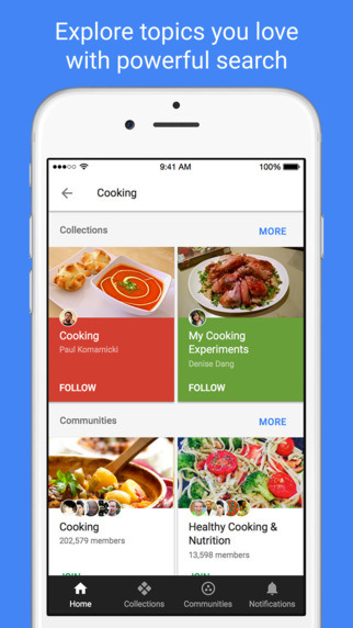
The redesigned UI on web feels a lot like a mobile app, so it's no surprise that the mobile apps look very similar. The design is much more consistent than it was in the past and actually gives off the feel of a hybrid app. If Google has in-fact utilized hybrid app development for Google+, that should make it easier to keep feature parity across Web, iOS, and Android.
The App Store has been updated with four screenshots in order to promote the features of the new app, and those screenshots represent the refocusing of Google+. As you can see below, Google believes the value it's social network brings is connecting you with your interests through the Stream, Collections, Communities, and Search.
 |
| Home Stream |
 |
| Google+ Collections |
 |
| Google+ Communities |
 |
| Google+ Search |
 |
| New Menu Drawer |
Along with this change is another that some may not like. Gone is the number that would tell you how many notifications you have. It has been replaced by a single red dot over the notification bell, Mr. Jingles.
Grab the New Update
The update has started rolling out to users via the Google Play Store and App Store. However, that may not do the trick on it's on since the update seems to be controlled on the server side of things too. In order to force the update, delete the Google+ app data in settings.
If you're on Android and haven't received the update just yet, we have the APK for you. Grab it using the button below.
What do you think of the new app? What do you love or hate about it?


